| Acorn Design System
Spooktacular Updates: All Treats, No Tricks from Acorn |
| |
| |
|
| | Welcome Maggie! Update on Desktop Variables New UX Project Template published New Aspect Ratio for Thumbnails Android Size and Space Tokens Mobile Figma Updates Progress on color palette Progress on desktop settings What's next
|
|
| |
|
| Team update - Welcome Maggie! |
| We're
happy to welcome our newest team member, Maggie Atkinson. She's joining
us as a Senior Design Systems designer on the Acorn team with a focus
on mobile. |
|
| |
|
| Learn more about Maggie:
Hi,
I’m Maggie (she/her)! I’m a design systems designer, previously at
Toast designing technology for restaurants and their guests. I love
obsessing over the smallest details, tackling big systems challenges,
and getting to collaborate and learn from a wide variety of people. When
I’m not working, you can find me solo traveling, solving NYT puzzles,
reading, or hiking in New England. Originally from the Philadelphia
area, I now live in Boston with my cat, Frankie. |
|
| |
|
| Update on desktop variables |
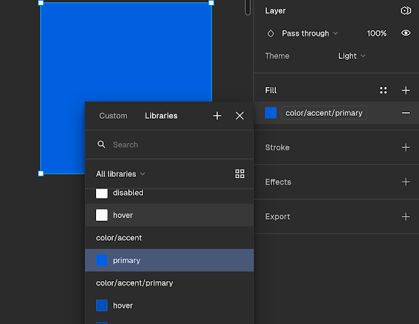
| In
early August, we added Figma color variables alongside our existing
styles in the Desktop Styles file in Figma as the first step in our
transition from Styles to Variables (Slack announcement). This week, we also added new typography styles, allowing you to switch between Mac, Windows, and Linux, as well as In-Content and Chrome modes. |
|
| |
|
| | Variables panel color fill example also highlighting where you can change the theme |
|
| |
|
| What's coming: Desktop libraries update in Figma Next, we’re
excited to announce a complete rebuild of our Desktop Components
library (V3!), built with the new variables and other powerful features
introduced in Figma. These updated components will streamline your
design process, making it easier to create new designs, experiment with
different themes, and explore component options with greater
flexibility. |
|
| |
|
| New: UX Project Template published |
| Yulia
has released an updated UX Project Template in the Acorn Template
Library! You can access the new version, make a copy, and customize it
for your projects. There will be future updates, so if you have any
feedback, leave a comment in the file or reach out to Yulia directly. Read Yulia's announcement on Slack |
|
| |
|
| New: Aspect ratio for thumbnails |
| Figma
is keeping us on our toes. You may have already seen it when opening
Figma, but all thumbnails now have to be 16:9 (instead of 5:3). We
updated the cover component in the file presentation library accordingly. Just update the component in your files! Tip: Because
components cannot be thumbnails directly and need to be inside of a
frame, you might need to adjust the size of that frame manually. |
|
| |
|
| Mobile Figma updates All
dark and private mode variants have officially been deprecated and
removed from the system. This is due to conflicts with using variables.
Going forward, to view a color or component in a different theme, please
toggle it via variables. If you encounter any bugs 🐛while using our libraries, please report it to our team in our slack channel #acorn-design-system. |
|
| |
|
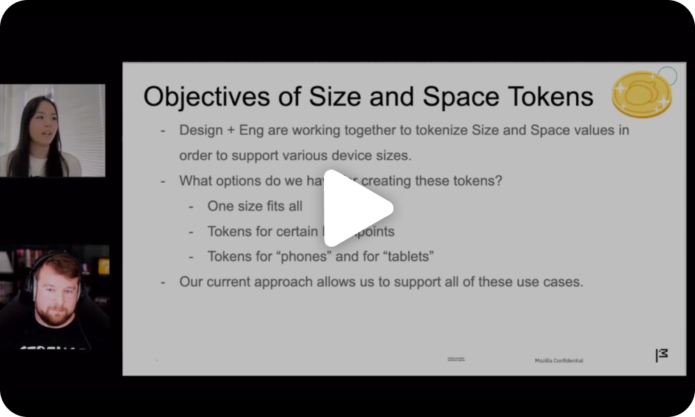
| Android size and space tokens |
| In
H2, Crystal, Maggie, Jules, and Noah on the Android engineering team
have been working together to tokenize size and spacing values on
Android. With
the size and spacing tokens system, we are moving towards the ability
to support a wider array of screen sizes, including tablets and
foldables, and will be able to leverage this system when designing new
features to also deliver more guidance on how and where the UI changes
across screen sizes.
Watch the video below for a deeper dive and demo of the project and what’s to come! |
|
| |
|
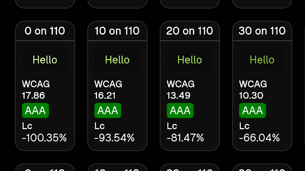
| Progress on new color palette |
| Jules shared the progress on creating a new color palette for our design system during UX sync this month. Check out the recording if you missed it.
We're releasing the new palette starting with desktop in H2. Mobile to come next year.
Note
that in H2, we will gather feedback on dark and light theme improvement
proposals (internally and externally) ahead of releasing new grays. |
|
| |
|
| Progress on desktop settings |
| We
already shared settings desktop early designs to UX, UXLT, and the
world (Connect + Reddit) in H2! But be on the look out because we have
been dialing down designs to share and gather feedback from feature
teams during a roadshow we've started in late October.
Thank you Sidebar designers, Yulia and Eric, who have partnered with us on form component standardization for Sidebar settings. Thank you Search designer, Josh, who has partnered with us on a new Search Shortcuts UI.
Due to this work, we will be launching stronger and more useful form components in our new Desktop Library version next year.
If
any of your upcoming work touches about:settings or form patterns,
please reach out to @jules or @Julian so we can work together! |
|
| |
|
| What's next: Documentation & Consolidated Intake |
| 2025 is the year of documentation for the Acorn team. We're
expanding the resources on our site, with more comprehensive
information on components and tokens for both desktop and mobile
platforms. Planning is already underway this quarter, and we'll be
launching these improvements early next year. Additionally,
we're revamping our page templates and contribution process to make it
even easier for you to access the information, tools, and support you
need—faster and more efficiently.
We're
also bringing the entire content team in through a better collaboration
system, and including engineering and accessibility in our site
documentation process. |
| We're simplifying intake and reviews Building
on the groundwork we laid earlier this year with our intake and support
request forms, we’re introducing a single, streamlined form to make
requesting help easier than ever. Plus, you’ll have clear documentation
at your fingertips, detailing what to expect when reaching out to our
team. Stay tuned for more updates! |
| Desktop Library V3 We’re
excited to announce a complete rebuild of our Desktop Components
library (V3!), built with the new variables and other powerful features
introduced in Figma. These updated components will streamline your
design process, making it easier to create new designs, experiment with
different themes, and explore component options with greater
flexibility. |
|
| |
|
| A
HUGE thank you to all the incredible teams we collaborate with—desktop
engineering, ReComp team, theme reviewers, iOS and Android engineering,
accessibility team, product managers, designers, researchers, and many
more. The partnership and dedication to creating together make all the
difference, and we’re grateful for everything we achieve together. |
|
| |
|
|
|
|
|