Voice and Tone
The primary job of the words in Firefox is helping users complete tasks and accomplish tasks, with no confusion and minimal interruption. But the words also offer a glimpse into Firefox’s personality. The voice and tone we use influence how people think and feel about Firefox. The words we choose — and the ways we use them — sound human because they reflect human goals: building trust, inspiring confidence, making things easier, and developing a relationship with Firefox users.
Authentic Voice
Voice is a way to describe our point of view and reflect the Firefox personality. The Firefox voice guides our priorities for communicating with users. These aren’t the only things we care about, and we don’t always need to talk about them, but if the words in Firefox contradict our values, we appear inauthentic and risk our credibility.
Here are some of our core beliefs, ideas that help shape the Firefox voice:
- We make Firefox for people, not profit. That requires us to be open and honest, and offer a fair value exchange.
- We care about performance.
- We value user privacy.
- We believe users should have meaningful control of their browsing.
Appropriate Tone
Our personal vocal tone varies with the situation — what we’re discussing, who we’re talking with, whether we’re calm or irritated. The Firefox tone works the same way, adjusting to align with a user’s need or state of mind. One way to look at tone is as a set of ranges along a continuum.
For areas where supporting the user is critical, like error messages or preference pages, our tonal ranges might appear like:
For areas where we aim to direct and motivate users — like snippets, onboarding, and sync sign-up — our tonal ranges might appear like:
Examples
Here the description of the issue is deprioritized in favor of a vague message. The “web pages get cranky” doesn’t shed light on the issue and can be interpreted as condescending to non-technical users.

Here the same page is rewritten to strike a tone that is neither alarming or silly. It demonstrates respect for the user’s understanding and time - with a clear headline that quickly surfaces an apology for the error and the impact of the error and a further description of the cause and possible solutions. The page also relies on illustration to signal to the user that this issue is not serious, but without directly telling the user what they should think or feel.

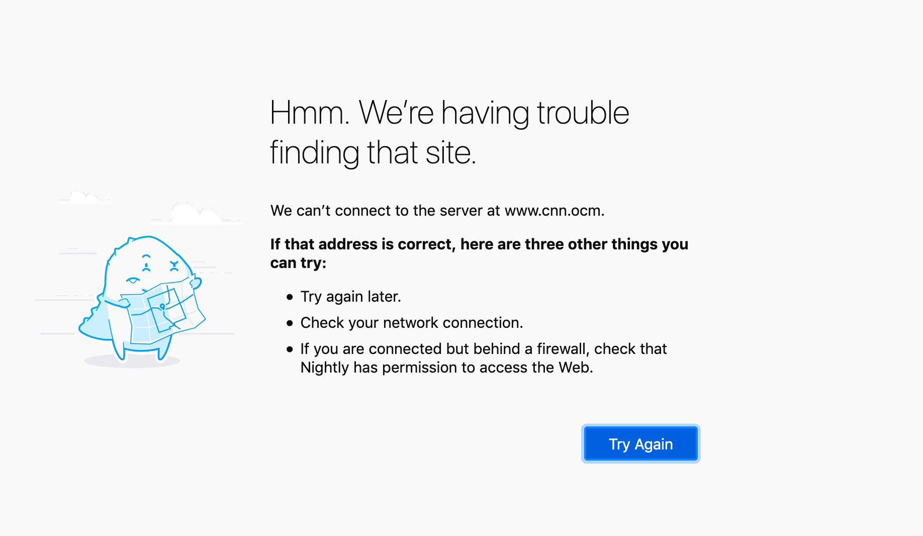
This error page, the result of a mistyped URL, focuses on what is happening to the software and is also dry and clinical. The stark language and page design (icon and grey and white caution band”) makes the error seem potentially dangerous and could be alarming.

Here the page is rewritten to explain the error in human terms: Firefox is having trouble finding a site rather than the server being unable to resolve the address. The illustration and the word “hmm” provide a bit of personality while signaling to the user that the situation is not dangerous. And, the user is provided with recommended actions.


